KUNUNU · LEAD PRODUCT DESIGNER & AI UX LEAD · 2023 – 2025
AI-Generated
Review Summaries
Role & Scope
Lead Product Designer (AI UX Strategy, Unmoderated Research, Prompt Engineering Alignment, & Design System Integration)
Cross-Functional Team
1 Product Manager, 2 Data Scientists / ML Engineers, 1 UX Researcher, 4 Software Engineers
Job seekers on kununu faced a wall of thousands of reviews with no fast way to evaluate a company. I led the end-to-end UX for an AI summary feature, orienting users to core sentiment without overwriting real employee voices.
3,000+
Customers with summaries live
Millions
Job seekers reached
~80%
Rate summaries trustworthy
13M+
Reviews distilled into insight
TL;DR / Executive Summary
- • The Challenge: With 13M+ employee reviews, job seekers experienced severe cognitive overload on large company profiles, bouncing before making career decisions.
- • The Solution: Led discovery research, interaction design, and LLM prompt tuning to build a collapsible AI summary card sitting directly above authentic user reviews on the Reviews tab.
- • Strategic Impact: Scaled across 3,000+ enterprise profiles reaching millions of B2C candidates, achieving ~80% user trust and boosting B2B employer brand profile subscription retention.
01: Overview
Too much to read
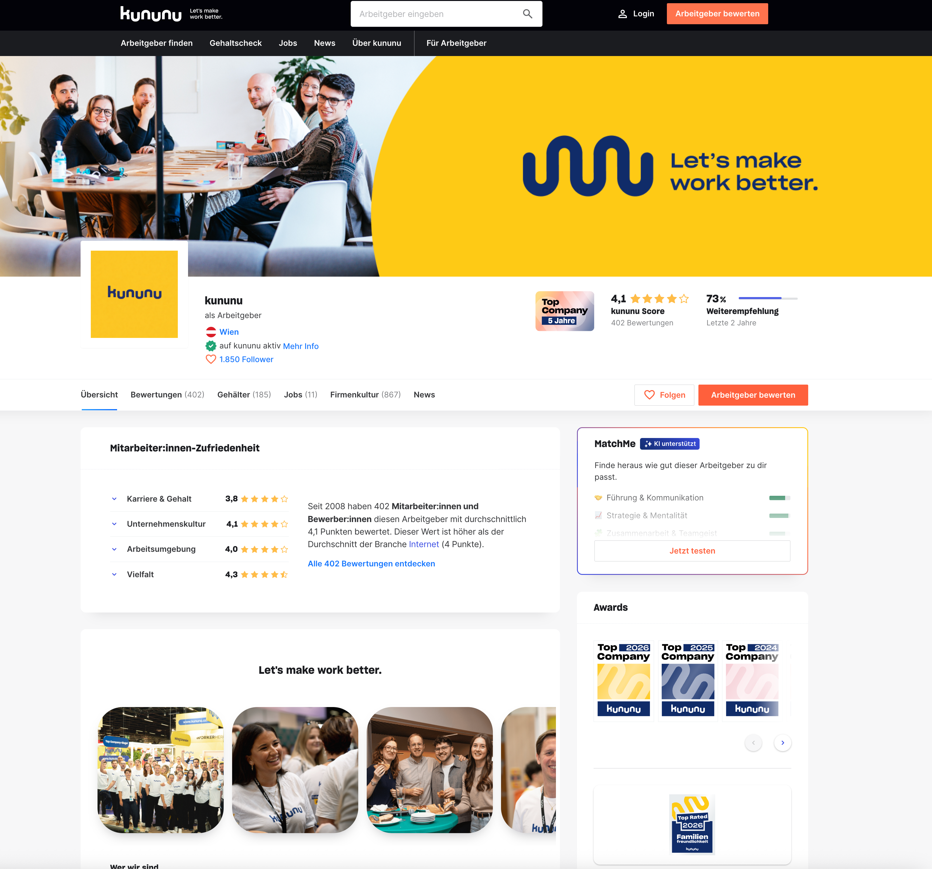
kununu is the DACH region's leading employer review platform, with over 13 million authentic reviews from employees and candidates. That breadth is the product's greatest strength, and its biggest UX challenge. When a company profile holds hundreds or thousands of reviews, job seekers often bounce before forming any picture at all. The content is there; the problem is access.
Internal data and user signals pointed to a pattern: users landed on company profiles, felt overwhelmed, and left without making a decision. Not because the reviews were unhelpful, but because there was simply too much to read. The opportunity was to reduce that cognitive load without flattening or filtering out what made the reviews valuable in the first place.
02: Research
Testing the hypothesis with real users
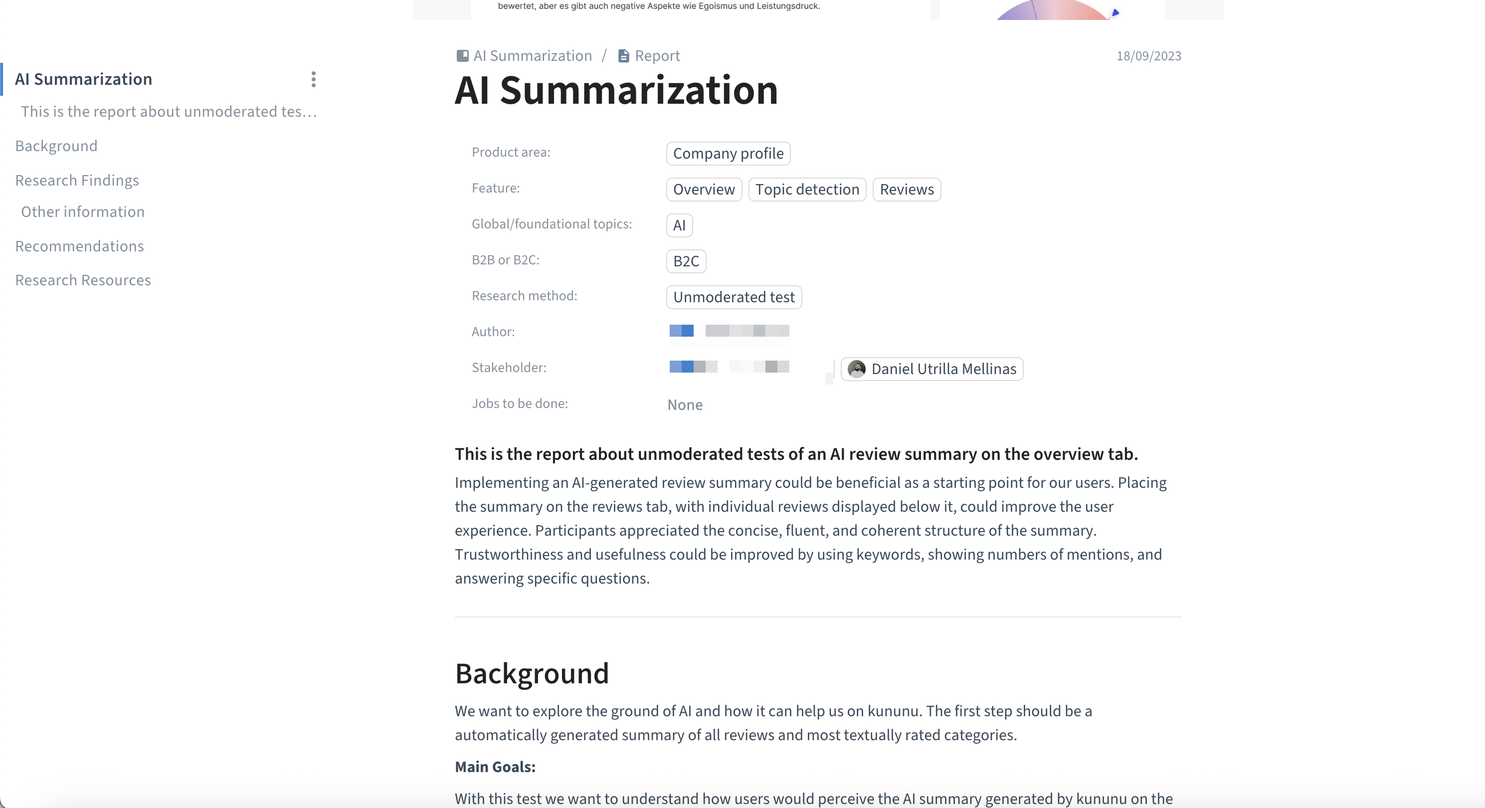
Before committing to a direction, I worked closely with a UX researcher on my team to define what we needed to learn. Together we designed an unmoderated user test via Userbrain in September 2023 (10 participants split evenly across desktop and mobile, all job seekers either actively looking or passively open to new opportunities). We shaped the research questions together: how is the quality and format of the summary perceived? Is it trustworthy? Does the user understand it's AI-generated? Is the flow free of friction?
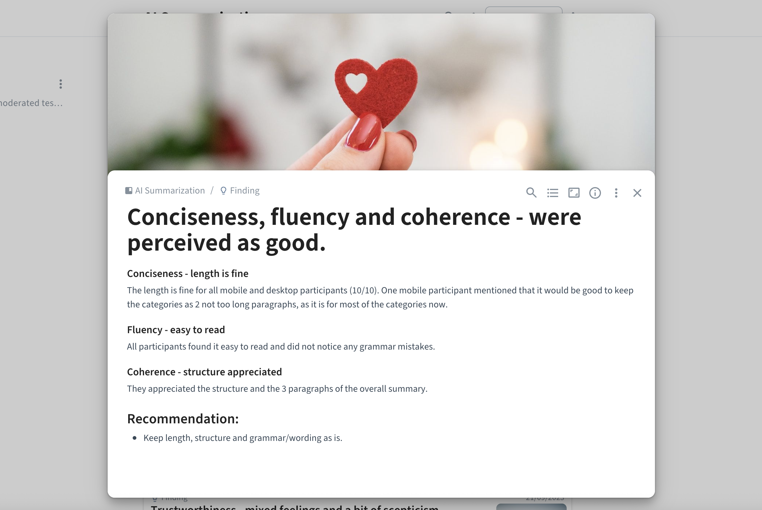
Six key findings shaped the design. Users found the summary concise, fluent, and easy to read (10/10 across devices). Most understood the content was AI-generated, even without an explicit label, though the recommendation was to make it clearer. The interactive topic categories were appreciated by those who noticed them, but half the participants missed them entirely. Most importantly: users wanted to see individual reviews alongside the summary, not instead of it. The summary could be a useful starting point, but they needed the real reviews nearby to trust it and decide whether to dig deeper.
03: Design Process
From overview to reviews: following the data
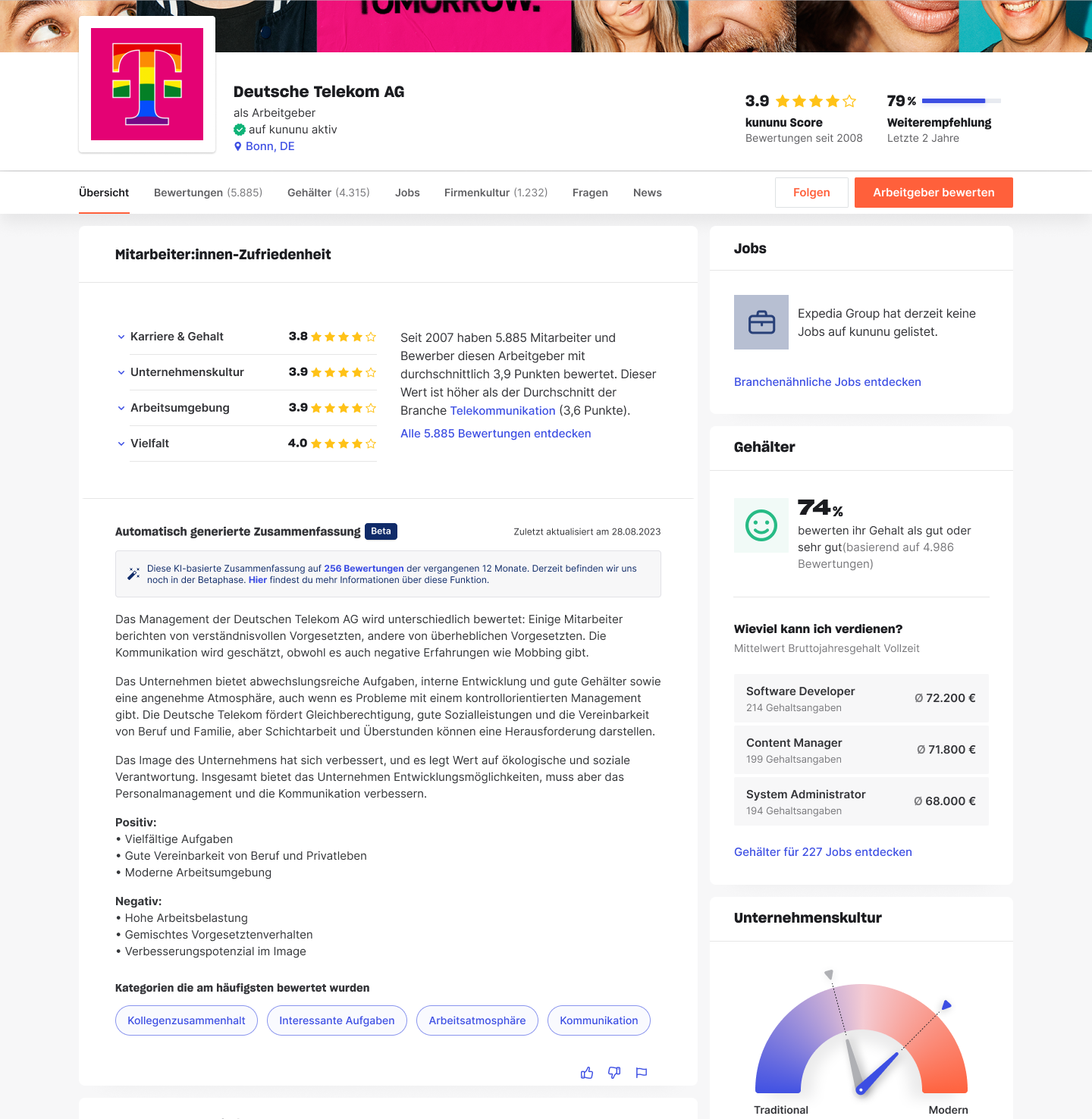
The first version placed the AI summary on the Overview tab, the main landing area of every company profile. This made sense as an initial hypothesis: give users a quick read the moment they arrive. We launched V1 to a beta group in Q4 2023, with the summary clearly labelled as AI-generated and expandable topic categories below it.
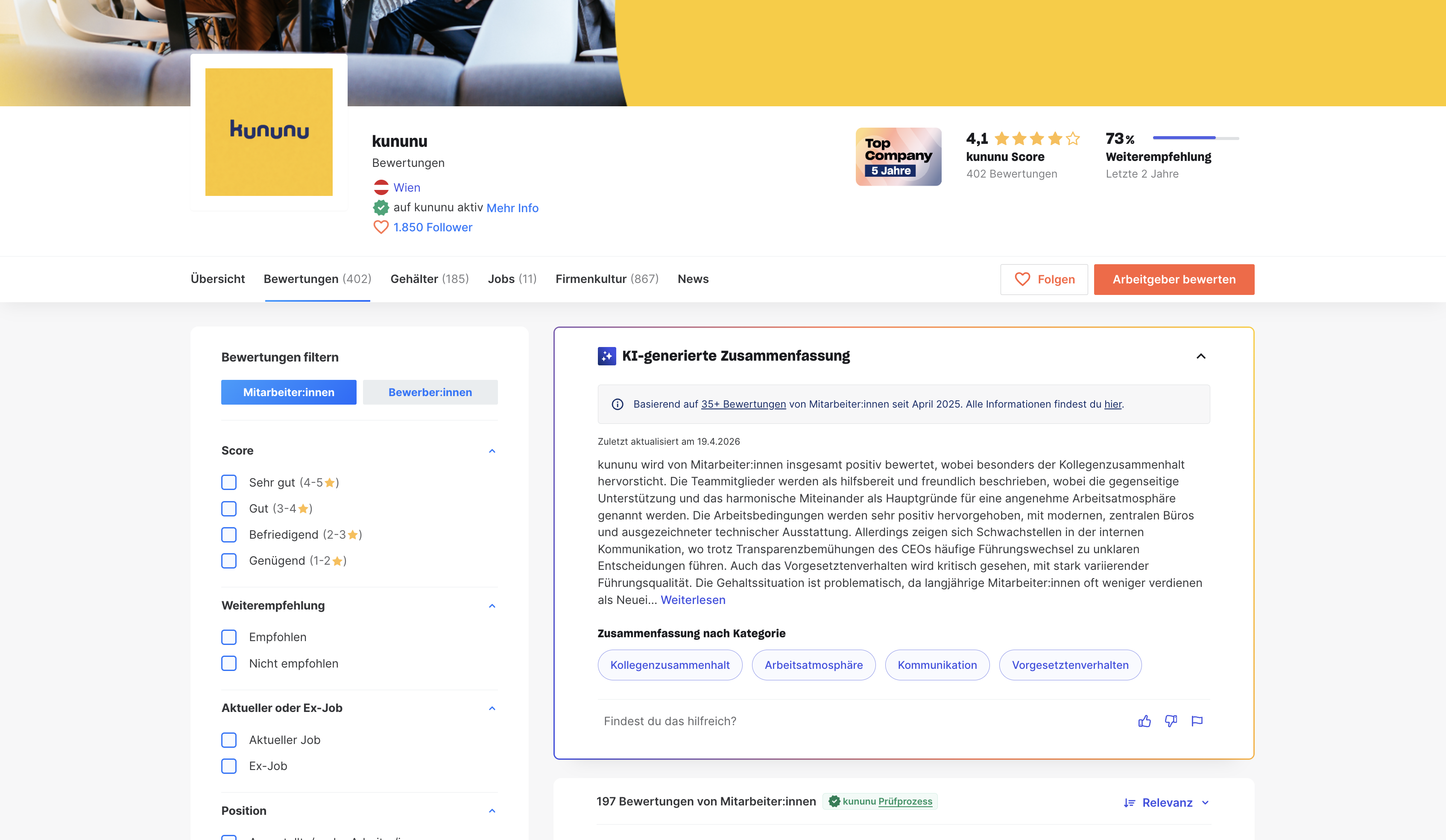
The usability study had already flagged it, and the in-product feedback confirmed it: users trusted the summary more when individual reviews were visible nearby. On the Overview tab, the summary existed in isolation. The research pointed clearly to the Reviews tab as the right home, where users already expected to engage with review content, and where placing the summary directly above individual reviews would reinforce rather than replace them.
V2, launched in 2025, moved the summary to the Reviews tab as a collapsible section at the top. Individual reviews appeared directly below, making the summary a jumping-off point rather than a substitute. It also rolled the feature out across all company profiles on the platform, not just a beta subset.
04: The Hard Part
Summarising without silencing
The most interesting design challenge wasn't the interface: it was defining what the AI should actually do. The core tension: how do you condense thousands of voices into a few paragraphs without losing what makes those voices meaningful?
Early versions of the summary struggled with large company profiles where employee opinions were highly polarised. The model defaulted to a pattern that neutralised the tension rather than surfacing it: "some people say X, others say the opposite." Technically accurate, practically useless. It told users that opinions exist but gave them nothing to orient around.
Working closely with the PM and Data Science team, I helped define a new approach for V2. Instead of averaging across all reviews, the model was refined to group reviews by semantic similarity and intent: identifying clusters of voices with shared sentiment rather than flattening them into a midpoint. The update also improved how the overall sentiment of a company was weighted collectively, so the summary could convey a genuine directional read while still preserving the honest complexity of what employees had written.
The design principle that guided all of it: orient the user to the content. Don't overwrite it.
"Orient the user to the content: don't overwrite it."
05: Outcome
A feature that earned its place
Over the course of the rollout, we tracked user sentiment across thousands of profiles and gathered qualitative and quantitative feedback. The beta phase delivered strong initial results: 75–80% thumbs-up rate across the first 1,000 profiles. After the wider rollout, the thumbs-up rate fluctuated during a period where the V1 model limitations were most visible on polarised profiles, dipping to the high 40s during that adjustment phase.
With V2 and the updated LLM prompt, satisfaction stabilised at a consistent 65–80% thumbs-up rate, now across the full platform, not just beta profiles. Qualitative signals supported the quantitative picture: both job seekers (B2C) and HR teams using kununu for employer branding (B2B) reported finding the summaries useful. Crucially, high summary trustworthiness directly correlated with a measurable uptick in B2B profile engagement and higher employer branding subscription renewal rates across DACH enterprise accounts.